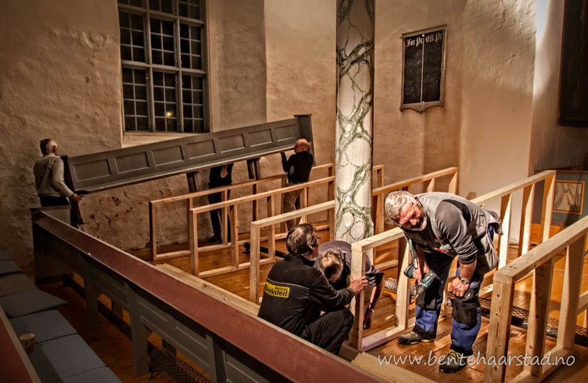
Some may have noticed I am not a big fan of HDR. As I work with documentary this is also not much of an option I feel. The pictures should not be transformed into something else. But there are no rules that cannot be broken. The picture above is from the interior of an old church. The light was very poor and whatever I did the picture looked messy. Then I tried to add just a little bit of HDR in the middle, to make the people working stand out a little bit more. This is done with the free version of the onOne software, and the effect is painted on, not a real HDR work. What do you think compared with the original picture. For better or worse?
The people are preparing the church for a theatre play, and the church will be closed for burials, marriages and the usual worship for about a month. More pictures from the Selbu church here.


I prefer the one with HDR, Bente.
Gr. Henk
LikeLike
The first one is my best, it is sharpen more… I haven’t any experience yet, with HDR, so don’t know much about. A nice action and working photograph. Thank you dear Bente, have a nice weekend, love, nia
LikeLike
I agree with you on the HDR. I think some images can get away with it and some should be left as they are. Ive tried it on some of my work and there is something about the HDR that is just leaves me with a ” NO” I don’t like it on my images and I have seen other people’s work and it has looked amazing. For me, I like your none HDR. It looks much cleaner and gives it a real feel to the image. The HDR version looks to harsh for me.
LikeLike
Better. I didn’t quite realize there was a third person there in the non HDR version. But that could be that I don’t have my reading glasses on! 🙂 Seriously, it defines the man sitting and the worker crouching much better. Great job!
LikeLike
Well I like it, the image that is….As you know I am not over the moon with HDR but have found that it does work very well for some images, it can be used to just bring out that extra detail. Not at all keen on the extremes of HDR conversions. As for On One, love their software but I use Photomatix for my HDR but still learning. Have to try the On One option.
LikeLike
To my eyes, the original picture looks more intimate, familiar; the enhanced one would probably be more striking for printing in a newspaper though. Very interesting! (I’m no fan of HDR myself either!)
LikeLike
In this case I prefer the original version only because I don’t think it benefits from the HDR treatment. Some photos do and I’m not opposed to using HDR, but only when the photo can benefit.
LikeLike
Ici le hdr est bien maitrisé, il n’y en a pas de trop, juste ce qu’il faut pour rendre la photo un peu plus “intense”
bonne fin de journée
val
LikeLike
The little touch of it helped highlight the workers and it’s still a pleasing picture. I’ve seen some that have so much of the “touch” that it looks almost like a poster – too surreal – but in this case I think it helped make the point of the photo.
LikeLike
The HDR here is very effective. I never knew about it so it was doubly interesting for me.
LikeLike
I’m old school. I like the second one better, more character. The first one reminds me of a Norman Rockwell
painting.
LikeLike
for me it’s the original, that’s the better one
in hdr skintones of the workers are too artificial
alltogether a nice shot
LikeLike
I gof for the second one to
LikeLike
Frankly, i think that by working with “curves” in photoshop you can get the tones nice and bright without the need to dabble in Hdr. The effect, if done as an afterthought rather than as a planned shoot, often tends to look a little gimmicky. Just my 5 cents’ worth…
LikeLike
I like both photos. But the HDR effect on the first one is great. It’s very vivid.
Go helg! 😀
LikeLike
I’m sure the first one is an improvement on the original.
LikeLike
I’ve also never been a huge fan of HDR, especially when it’s obvious. I think your shot benefitted without making the HDR treatment really obvious. One thing I learned from my workshop though is there is a treatment (that I have yet to learn) that could have pulled out and highlighted the people without emphasizing the column behind them quite so starkly. It mimics the old techniques of dodge and burn that old-time photographers used to use in the darkroom. I hope to learn more about it, but it involves using layers, can’t remember off-hand exactly which software was used either.
LikeLike
The original is a much moire realistic photo. HDR looks artificial and the facial coloring and features look abnormal to me. Just a non-pro opoinion
LikeLike
I like it very much Bente. I think all these techniques have their place.If I need to bring out shadows to balance an exposure I’m more likely to use exposure blending these days which can be done with Photomatrix. It’s a lot more subtle.
LikeLike
I’m not a fan of HDR either, but in this case it does look nice. You can see more detail. It doesn’t look too artificial at all.
(I would have increased the ‘definition’ slider on the iPhoto editing software of my Mac Pro if the original had been mine, which would have had a similar effect as the onOne software).
I love the composition. It’s one of those wonderful photos which draws your eye in to the people in the light, and moves your eyes around the photo from the man sitting on the front pew to the two men carrying the other pew. Very nice indeed.
LikeLike
They each have merit, but I like the first slightly better.
Nice shot, Bente.
LikeLike
I vote for the original. It just looks natural. No need to “enhance”.
LikeLike
I prefer non HDR as well. I liked the first picture well enough until I scrolled down to the second, which just seems more natural to me. But in some ways the HDR makes the image look more deliberate. Not expressing that well, but without the HDR it looks like a normal photo I suppose, a slice of reality, whereas with HDR it is more like a painting, like something staged or posed. I guess it depends what the intention and purpose of the picture is.
LikeLike
Looks awesome 😀
LikeLike
Surprisingly I like the non-HDR version more! 🙂
LikeLike
Picture number 2 seems more realistic, capturing what the eye would see. Of course, that’s only what my eyes might see …
Thanks for another thoughtful shot.
LikeLike
Quite subtle… I normally prefer photos without HDR effect, but I have to admit that it is working well in this one.
Jota.
LikeLike
I don’t think that the original is that bad, but I also like the HDR version.
LikeLike
I love the HDR photo. Remember Ansel Adams did his best photography in his dark room After all photography can be an art form.
LikeLike
Det er meget velvalgt, Bente. Spændende at se billederne op imod hinanden. Jeg foretrækker HDR i denne situation.
Mange hilsner Hanna
LikeLike
Bente, love the first one 🙂
LikeLike
The touch of HDR does certainly ‘lift’ the image, Bente.
LikeLike
I absolutely agree with you. I see too many pictures processed with HDR that only makes them look strange or at best like HRD has been used for the effect itself. In this case, though, it really brings more details into the picture in a good way. It lifts the workers and adds clarity. Generally I don’t think using HDR necessarily is a problem in a documentary approach, but it’s usually not for the benefit of the picture.
LikeLike
Reblogged this on T A R L O U Z E.
LikeLike
You can see deeper into the shadows in the first, which I like, but I like the overall contrast of the second. I had never thought about trying to use HDR the way you have used it. I ignore it most times because the images appear unrealistic, like you and your other commenters alude to.
LikeLike
I like the original very much. I agree that the figures are much more enhanced with the selective application of HDR, but I’m not certain that the man bending over looks entirely natural. Beautiful photographs either way.
LikeLike
I’m testing D850, N-Z, 5D III, Sony A7R —– it seems, that A7R showing the most “processed images” = whether we like it
or not, the camera’s image processor wouldn’t leave us alone. (like artificially created Bokeh in the smart-phone camera, or
automatically corrected chromatic aberration.etc) —– we may need to go back to film.
LikeLike